convinced, that could be a nice looking film,
the real work started. because n o w everybody
in layout and background had to learn how to
draw and paint in that style. we spent several
months to train the layout artists to compose
different. the same with the background guys.
they had to give up their beloved detail and
getting lost in painting evrything you could
only see in reality with a magnifying lens.
the hardest thing was for me, to understand
myself, what I had done. I had painted with
my intuition and the feel for it, but explain that
to someone who is lost with his big 12 field
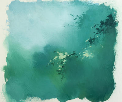
white paper. tom schumacher called the style
of the film - poetic simplicity. well, our explanations
to the artists had to be a bit more detailed.
here are some of the rules we came up with -
the style is not over-detailed and linear, not
realistic, literal and perspective-correct.
it is more graphic, simplified, cartoony and organic,
poetic, moody like the silly symphony style of
the late thirties. we don't want to copy nature,
we want to caricature, simplify - a translation
of nature.
to say it very complicated -
the style is an impressionistic abstraction of
nature with caricatured very typical chinese
elements.
we found out that it did not work at all
to use the beautyful landscape and architecture
studies we had done. all of them had to be redrawn
and changed into a more cartoony look
before they could be painted. not one single
paralell line was allowed. the old rules - straight
versus curved, thick versus thin, short versus
long - or - yin and yang.
it took a while for everybody to adjust. the
result were beautyful composition studies and
very moody paintings.
a big advantage for the film was that it was
produced in the florida studio. most of the layout-
and background artists were very young and
unexperienced. they were hungry to learn.
and they were growing every day. I often
remember that happy time.
of course problems came up during production.
how do you combine a simple treated landscape
with the palace of the emperor that was asking
for tons of detail.
another big challenge was the hun attack. cg was
not really developped then. it took about 2 years
to finish all the combinations. I am still surprised
when I look at it now, how everything fits pretty
well together.
during the learning period I continued to put
together a style guide. first it was just for myself.
to write down with sketches, what I did not want.
after a while it grew bigger and bigger. and everybody
wanted to have copies. as a handbook about how
to do it and what to avoid.

since that time every single movie had its style-
guide. and I continued to refine the experience
after all these films. that is taking shape now as
a book about composition and color in animated
movies. in the future I will post some of the pages.


No comments:
Post a Comment