after too many tries for hours and
tons of stupid error messages -
I had it.
this is final
I continue on a new blog
another blog every month -
not too bad!
you see the link on the right
mad-t-party
very nostalgic. it was the first
company I started in duesseldorf -
germany - in 1985.
we were 4 very crazy artists, like
the mad tea party in ALICE IN
WONDERLAND...
you probably know 2 other members -
uli meyer and harald siepermann.
Thursday, September 29, 2005
Wednesday, September 28, 2005
favourite
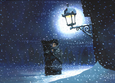
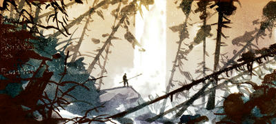
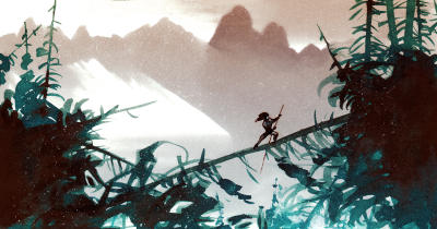
it must have been in 2000 when they asked me to
come up with some ideas for THE LITTLE MATCHGIRL.
that hans christian andersen story was always one of my
favourites. so I spend some time in intensive research
about st.petersburg, the architecture, the costumes of
the mid-nineteenth century, and the russian painters from
that era. someone else took over the art direction,
and the character design went into v e r y different
directions. it's not my favourite story anymore.
london 1992
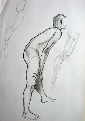

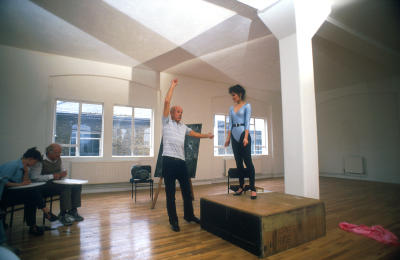
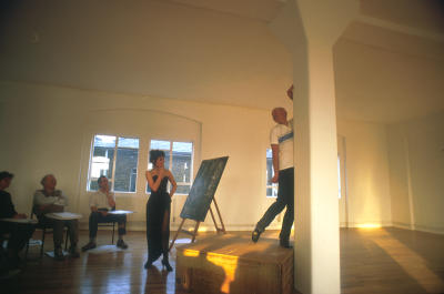
during my time at AMBLIMATION in london we organized
life drawing classes once a week. and of course who
was the best instructor you could imagine -
JOHN WATKISS. I knew john already for many years.
what an artist. probably in my oppinion the best
drawing artist around today. he spent the time
and gave nearly everybody some very detailed
corrections. I learned so much.
later I was very happy that john started to work
at disney in L.A. I am sure most of you have seen
some of his unbelieveable artwork for TARZAN.
he did maybe 100 huge paintings in panavision format.
of course nothing was used, the paintings are hanging
now in some executive offices - they are so nice
and B I G ...

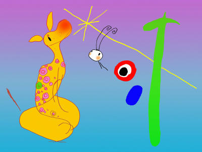
simon wells did a caricature of me reading
the wonderful script for the just so stories.
joe grant 1998

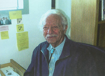

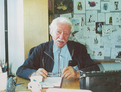
joe gave me color xeroxes of these pictures
in 1998. burny mathinson did them. the two
of them shared an office next door to mine.
burny had bought a huge agfa scanner and the
biggest epson printer on the market at that
time. these two guys had so much fun with
their computer and all that new equipment.
they were doing all their presentations for
new projects nicely edited, printed and bound.
amazing. I had just got my own mac and had
no idea what to do with it...
Tuesday, September 27, 2005
dinosaur lunch

during the eighties I had a chance to attend
2 of the so called 'dinosaur lunches'. some
of the disney old-timers met in a restaurant
in toluca lake, as far as I remember it was
'alphonse's'. it was a great honour, you could
only join if you knew one of the participants.
andreas deja arranged that. I never forget
that, because I had a chance to meet one of
my biggest idols, KEN ANDERSON. in the photo
on the right. on the front-left is COLIN CAMPBELL,
one of the top disney layout artists. maybe
someone can help me to identify the other
attendees. sorry, I forgot over the years...
MARCELO VIGNALI sent me the following letter -
...I used to attend the Dinosaur lunch too. As a
matter of fact, I think I saw you there on a few
occasions along with Andreas Deja. Anyway, a
friend of mine got me in and I went for six months
or more. Maybe it was closer to a year .. anyway,
I can name the gentlemen for you.
The gentleman sitting next to Colin Campbell is
Bill Anderson. "The Disney Legend Bill Anderson."
You can IMDB his name to pull up his film credits.
If I'm not mistaken, he did Old Yeller and
20,000 Leagues Under The Sea. The other gentleman
seated next to him is Clem Hall ... I'm not exactly
sure if he worked on the Disney animated films, but
I know he was a professional illustrator before
coming to Disney. He and Colin had giant mural like
oil paintings on display at EPCOT's American Adventure.
Clem also had his own illustration company during
the 60s where he did a lot of the auto ads for GM.
I would imagine he came in for EPCOT. And the other
gentleman is Ren Wicks ... he was 82 in that picture
if you can believe it! He looked and acted like a man
in his late sixties. He was also an illustrator, and
perhaps the best illustrator Disney ever got their
hands on. He did work for Colliers and Saturday Evening Post
during the golden age of illustration. Around the time
the picture was taken, he was not only working, he had just
completed an illustration for a postage stamp for the
US government and was bragging about it. He was a lot of fun,
sharp as a tack, and very friendly.
Ren was the comedian of the group.
marcelo vignali
walt stanchfield
grim natwick
in august 1990 grim natwick celebrated his
100.birthday. everybody from the animation
family came together to honour this legendary
master.
it was unbelieveable, all the best known
animators of the past 60 and more years
were there
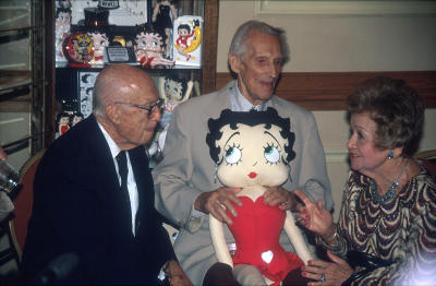
here is grim natwick together with walter lantz
and mae questel, who was betty boop's voice
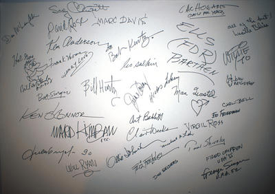
I had to take a picture of grim natwick's
birthday card. look at the signatures,
it's probably a collection of the most
famous animation giants of our days.
I will post more pictures from that event.
it takes time to scan them all. it was
before the digital era, it's all slides!
100.birthday. everybody from the animation
family came together to honour this legendary
master.
it was unbelieveable, all the best known
animators of the past 60 and more years
were there

here is grim natwick together with walter lantz
and mae questel, who was betty boop's voice

I had to take a picture of grim natwick's
birthday card. look at the signatures,
it's probably a collection of the most
famous animation giants of our days.
I will post more pictures from that event.
it takes time to scan them all. it was
before the digital era, it's all slides!
friday nights
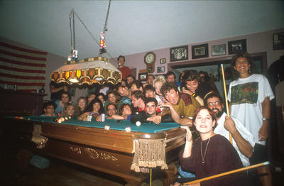
during the 'golden nineties' friday night was
'spaff'-night. nearly everybody of hollywoods
animation world met at dave spaffords house.
as far as I remember spaff started these events
after our work on ROGER RABBIT in london, when
friday night was pub night. it continued for
years. and it was there where you got the latest
inside information. thank you dave for these
unforgettable memories.
Sunday, September 25, 2005
Thursday, September 22, 2005
history
in 1989 disney started another london 'adventure'.
probably after the good experience with european
artists in london on 'roger rabbit', disney choose
jill and dick purdum as the directors for a new
adaptation of BEAUTY and the BEAST. dick and jill
had an animation commercial studio in the westend.
their own work commitments did not allow them
to leave london immediately to work on the projekt
in L.A., so they all decided to move some of the disney
artists for some months to london to work on a
story-reel of the project. there was don hahn, the
producer. andreas deja and glen keane from animation,
tom sito from story, jean gilmore visual development,
derek gogol from london, prod.design, michael dudoc
du witt storyboard and me for storyboard and design.
we worked all in the purdum studio during early fall
of 1989. I will always keep these weeks in my memory
as one of the best work experiences. to be in such a
creative environment with all these high caliber artists
and especially with jill and dick as the 'parents' of the
project, and don hahn with his unmatched humour.
we all were so committed, that we worked 14, 16
hours a day. at that time I remember that I did not
see anything of london. we just worked like crazy.
and we finished in a very short time a story reel in
color, about 50 min long. the first act. it was not a
typical disney movie, more a european version. but
we all believed in it.
well, they didn't in L.A. and probably because they felt
so bad to throw all our work in the trash, they decided
to send us to the loire area in france, where beauty
and the beast could have happened in one of these
beautyful castles. our trip lasted 4 days, - maybe 20
castles, lots of driving, even more historic stories from
'historian' tom sito, and so much fun. we were a family.
that never happened again in my whole career, that I
felt so much at home. all the others as well. we had
good french food and even better wine. of course
nobody understood that some germans liked sweet-
bread, horse steak and bambi filet. from then on they
looked at me as the barbarian.
that reference trip could have created an incredible looking
movie. we shot thousands of pictures, video, did tons
of sketches. unfortunately some more influental individuals
back in L.A. decided that the castle should look more like
the disneyland castle. I understand that. american kids should
not be confused with some unreal designs from somewhere
over there in barbarian land. the architecture of the village
is in my oppinion much nicer in the movie than in real life.
I love the incredible character designs of the village people,
so french! all that opening sequence "bonjour", how beautyful.
I still have tears in my eyes.
that's why I was not able to see much more of the rest of
the movie. but I am sure it looked just g r e a t.
anyway, the g o o d memories stay!
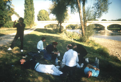
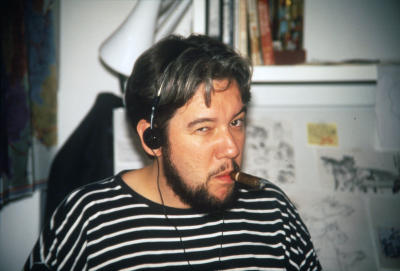
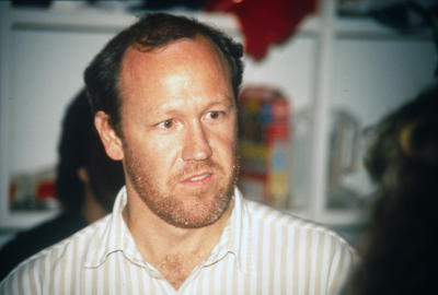
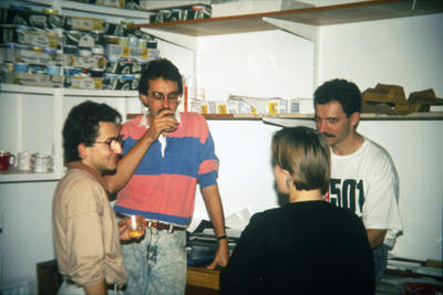
here are some of the many pictures from my archives.
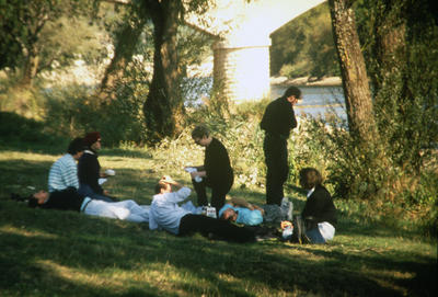
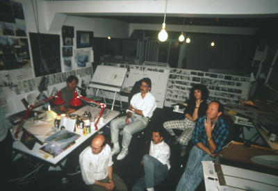
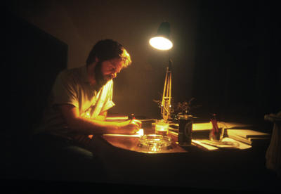
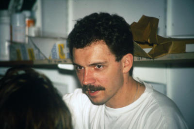


Wednesday, September 21, 2005
fraidy cat
in my last article I mentioned the
project FRAIDY CAT. for those who
are interested to know, what happened
to the cat recently - here is a very
interesting article by jim hill media
www.jimhillmedia.com/mb/articles/printer_friendly.php?ID=1604
project FRAIDY CAT. for those who
are interested to know, what happened
to the cat recently - here is a very
interesting article by jim hill media
www.jimhillmedia.com/mb/articles/printer_friendly.php?ID=1604
Tuesday, September 20, 2005
a new artform
after over 3 years of work the studio finally shelved
CLUB WILDLIFE in 2000. it was one of the most
creative and disastrous time in my life. for some time
I am struggling where to start to write about this
chaotic experience. so - be patient please.
what we were preparing was the first cg-movie
in disney history. and I did not want it to look
like what I had seen so far - like plastic. we came
up with a very unusual look, for characters as well
as environment.
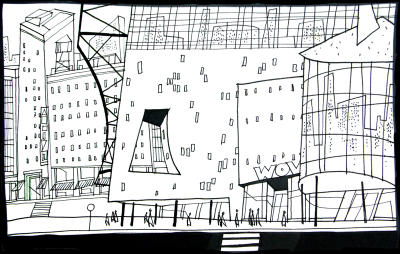
anyway, the dream of a new artform-piece was over
and I started to explore new ideas and looks together
with umesh shukla, who had been head of CG on
wildlife. umesh is from india and has a background
in graphic design as well. what was very helpful,
because he knew everything about art a n d
everything about the new technology. in the very
beginning I remember he told me - never think
about how we might solve that look problem in
the end, design whatever you want. I will make it
work.
that was incredible, no limitations! we worked for
a while on a complete new look for the florida
project MY PEOPLES, now shelved as well. I tried
to mix all different american painter styles together.
especially - thomas hart benton and grant wood.
their very unique landscape composition as well
as an interesting use of lots of textures looked
very appealing and new to me. and we looked into
bill peets childrenbooks and his way of using nib-
hatching to create textures.
paralell to my design work umesh started with
some experimental 3-D tests, to somehow
recreate the above described look. the results
were very interesting looking, like nothing I had
seen in CG before. very artistic. that might
have been the reason that nobody from the
decisionmaking guys understood, what the hell
we were doing.
it became even worse when umesh and I started
to develop a short for the at that time planned
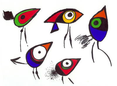
fantasia 3000 or 4000. my idea was to show abstract
art of the last 70 years, combined in a simple story
about a bird that doesn't fit into a bird society.
kind of a non-conformist dreamer. we did CG-tests
with 3-dimensional paintings in the style of klee,
picasso and matisse.
they shelved it. - nice.
what we had tried to do was a marriage between
traditional and CG animation. and to create a look
using the new technology, that had been impossible
even to dream about some years ago. we wanted
to come up with a new artform, not another
piece of plastic. but probably it was too much art.
after that umesh and I worked briefly on a new
promising project FRAIDY CAT. but it became
less and less interesting for the same old reasons -
comittee-decisions can screw up the nicest story.
we both left the company. umesh has now his
own development team and is working on soft-
ware that might make it possible to create better
looking CG movies in the future.
CLUB WILDLIFE in 2000. it was one of the most
creative and disastrous time in my life. for some time
I am struggling where to start to write about this
chaotic experience. so - be patient please.
what we were preparing was the first cg-movie
in disney history. and I did not want it to look
like what I had seen so far - like plastic. we came
up with a very unusual look, for characters as well
as environment.

anyway, the dream of a new artform-piece was over
and I started to explore new ideas and looks together
with umesh shukla, who had been head of CG on
wildlife. umesh is from india and has a background
in graphic design as well. what was very helpful,
because he knew everything about art a n d
everything about the new technology. in the very
beginning I remember he told me - never think
about how we might solve that look problem in
the end, design whatever you want. I will make it
work.
that was incredible, no limitations! we worked for
a while on a complete new look for the florida
project MY PEOPLES, now shelved as well. I tried
to mix all different american painter styles together.
especially - thomas hart benton and grant wood.
their very unique landscape composition as well
as an interesting use of lots of textures looked
very appealing and new to me. and we looked into
bill peets childrenbooks and his way of using nib-
hatching to create textures.
paralell to my design work umesh started with
some experimental 3-D tests, to somehow
recreate the above described look. the results
were very interesting looking, like nothing I had
seen in CG before. very artistic. that might
have been the reason that nobody from the
decisionmaking guys understood, what the hell
we were doing.
it became even worse when umesh and I started
to develop a short for the at that time planned
fantasia 3000 or 4000. my idea was to show abstract
art of the last 70 years, combined in a simple story
about a bird that doesn't fit into a bird society.
kind of a non-conformist dreamer. we did CG-tests
with 3-dimensional paintings in the style of klee,
picasso and matisse.
they shelved it. - nice.
what we had tried to do was a marriage between
traditional and CG animation. and to create a look
using the new technology, that had been impossible
even to dream about some years ago. we wanted
to come up with a new artform, not another
piece of plastic. but probably it was too much art.

after that umesh and I worked briefly on a new
promising project FRAIDY CAT. but it became
less and less interesting for the same old reasons -
comittee-decisions can screw up the nicest story.
we both left the company. umesh has now his
own development team and is working on soft-
ware that might make it possible to create better
looking CG movies in the future.
Saturday, September 17, 2005
tim burton quote
I found a very interesting quote from
tim burton about traditional animation.
he said -
' in hollywood, they think drawn animation doesn't
work anymore, computers are the way. they forget
that the reason computers are the way is that
pixar makes good movies. so everybody tries to
copy pixar. they're relying too much on the
technology and not enough on the artists.
the fact that disney closed down its cel animation
division is frightening to me. someday soon,
somebody will come along and do a drawn-animated
film, and it'll be beautyful and connect with
people, and they'll all go, 'oh, we've got to do
that!' it's ridiculous.'
Tuesday, September 13, 2005
reference
during the time I studied graphic design
at the folkwang school in essen, many of
my friends were in the photography class.
a lot of them are now very famous and
members of magnum and other groups around
the world. that's how I got interested in
photography. and I found out soon, that
you can 'paint' with your camera as well.
the other very useful sideeffect was that
I could create my own reference archives.
when I started to work on beauty and the
biest I shot hundreds of pictures in the
german forests and small medieval villages.
on a reference trip to the loire valley
organised by the disney studio I shot
probably even more in and around the
beautyful castles. besides that it was
an incredible trip, with the purdums
( at that time planned directors ),
don hahn the producer, andreas deja,
glen keane, tom sito, jean gilmore and
thom enriquez. hope I did not forget
anybody. what beautyful and very funny
memories! these were the good days.
anyway, what I wanna say is, I love
photography at least as much as drawing.
that's why I started another blog
where I publish some of my pictures.
in case you are interested -
twelvefield.blogspot.com/
Sunday, September 11, 2005
analysis 2
so, here we go with more films to learn
from. there is no order, I am sure I forgot
some great movies. let me know...
MATRIX TRILOGY - wachowski brothers
GIRL WITH A PEARL EARRING - peter webber
RAISING ARIZONA - joel coen
HOUSE OF FLYING DAGGERS - zhang yimon
THE CRANES ARE FLYING - mikhail kalatozov
CHARACTER - mike van diem
EXCALIBUR - john boorman
norman jewison - THE THOMAS CROWN AFFAIR
THE RED VIOLIN - francois girard
MOULIN ROUGE - baz luhrmann
SHADOWS AND FOG - woody allen
LE PACTE DES LOUPS - christoph gans
stanley kubrick - BARRY LYNDON
and now more in alphabetical order
FRITZ LANG - dr.mabuse, siegfried, metropolis, 'm'
DAVID LEAN - oliver twist, bridge on river kwai,
lawrence of arabia, dr.zhivago
ROMAN POLANSKI - repulsion, fearless vampire killers,
rosemarie's baby, macbeth, chinatown, 9th gate
MICHAEL POWELL - thief of bagdad, black narzissus,
red shoes, tales of hoffman
CARL REINER - dead men don't wear plaid
KEN RUSSELL - music lovers, tommy
RIDLEY SCOTT - the duellists, alien, bladerunner,
legend, black rain, gladiator
STEVEN SPIELBERG - duel, jaws, raiders of the lost arc,
jurassic parc
JACQUES TATI - mr.hulot's holiday, mon oncle
BERTRAND TAVERNIER - a sunday in the country, beatrice
and the great 'film noir'director
JACQUES TOURNEUR - cat people, out of the past,
curse of the demon
ANDRZEJ WAJDA - ashes and diamond, danton
PETER WEIR - picnic at hanging rock, year of living
dangerously, whitness
ORSON WELLES, my personal favourite -
citizen kane, the stranger, macbeth, othello,
mr.arkadin, touch of evil, the trial
BILLY WILDER - double indemnity, sunset blvd,
witness for the prosecution
FRANCO ZEFFIRELLI - romeo and juliet, othello,
brother sun sister moon
there will be a few more soon...
Saturday, September 10, 2005
analysis 1
apparently a lot of you are very interested in
composition in film. well, today with nearly
everything available on the DVD market, it is
pretty easy to get some good movies, watch and
analyze them. what makes them look so good, how
do they do the editing, why did they cut the
action sequence like that, great use of light
and shadow, and camera-angles... - learn from
the masters.
that's why I thought I share with you, whoever
might be interested, a list of - in my oppinion -
some very good directors and their respective
cameramen and designers. after a while you will
notice, it's not that big of a secret to do a
good looking movie. it's most of the time the
story that makes it work.
so - here we go, alphabetically -
MICHELANGELO ANTONIONI - blow up, l'avventura
INGMAR BERGMAN - the 7th seal, wild strawberries,
the silence, the winter's light
BERNARDO BERTOLUCCI - the conformist,
last emperor, sheltering sky
GEORGE CUKOR - my fair lady, travels with my aunt
VITTORIO DE SICA - the bicycle thief,
miracle in milan
SERGEJ EISENSTEIN - battleship potemkin,
alexander nevsky, ivan the terrible
FEDERICO FELLINI - la strada, la dolce vita,
8 1/2, satyricon, amarcord
MILOS FORMAN - hair, amadeus, valmont
JOHN FRANKENHEIMER - grand prix, 52 pick-up,
french connection
TERRY GILLIAM - time bandits, brazil, 12 monkeys,
ALFRED HITCHCOCK
- rebecca, spellbound,
parradine case, dial M for murder, vertigo,
psycho, the birds, frenzy
I will soon continue the list...
Friday, September 9, 2005
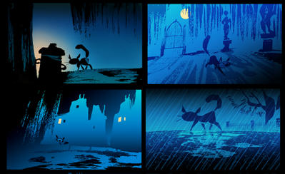
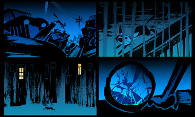
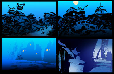
midnight story
Wednesday, September 7, 2005
Subscribe to:
Comments (Atom)


