still working in london at spielberg's amblimation
studio. my job was prod.designer/art director on BALTO. a
little bit later I would like to talk about the time in
london and my work on CATS and BALTO.
andreas deja, a good friend and former student in
germany, now one of the top animators at disney, had
called me and talked about a future project disney was
planning - CHINA DOLL. he explained the showdown between
mulan, her army-friend and the emperor. I liked that
ending actually way more than the ending in the final
film. it was a mix-up story, where mulan had to decide
between the life of the emperor and her friend shang.
anyway, that story sounded too good! and china! designs
in a very new style, mysterious, poetic, far away. and I
was stuck in london in that icy alaska movie. well, I
bought some books about chinese art, because I had no
idea about that part of the world and their culture. the
more I read and the more I saw, the more I got trapped!
I started to do some sketches, just for myself and
without disney knowing about it. funny is, that barry
cook, the first mulan director, saw these designs later
and they made him decide that I was his first choice to
design the entire film.


well, in march 1994 I left london and the amblimation
crew. MULAN was not the reason. it was the very
uncertain future of that studio. nobody wanted to tell
me any details of spielbergs plans. about a year later I
understood why - he started together with katzenberg and
geffen DREAMWORKS in los angeles. and most of the
artists I had worked with in london moved to L.A. and
worked 'next door'.
I moved with my wife hanne in june 1994 to L.A. and
started at disney, first time in my life employed. a new
experience! the first projects I started with as visual
development artist were HERCULES, FANTASIA 2000 - tin
soldier, beethoven's 5th, and DINOSAURS. MULAN had
already a development crew working on it for nearly one
year. amongst them was chen-yi chang, who became later
the character designer of the movie and my good friend.
I could not have designed mulan without him, he
explained very patiently everything about china, gave me
the r e a l books and background information. and he
knew the best chinese restaurants in town!
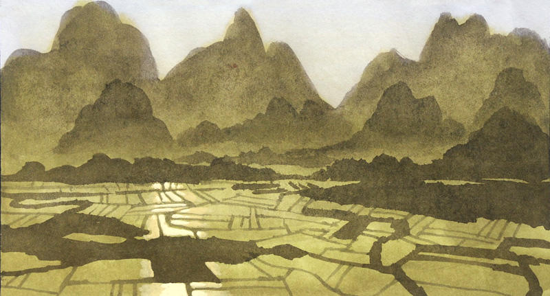
the MULAN visual devel.team had problems with the style.
they tried to copy chinese watercolor paintings, did it
the disney way, with tons of detail everywhere and were
kind of lost. barry cook, the director, asked me in dec.
1994 to take over as production designer. that was a
challenge. I had not a clear idea where to go, but I
knew, I didn't want a look like the recent disney
movies, like beauty and the beast, aladdin and lionking.
I had worked on all these projects as well and will
later talk about them a bit more with lots of artwork.
chen-yi had shown me some original chinese comic books.
thick, about 300 pages each. with very delicate
black/white drawings in some styles I had never seen
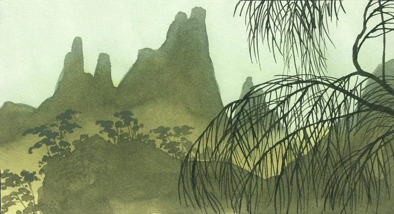
before. they showed a very unique way to draw trees,
mountains and villages. not to talk about the human
characters, animals and props. they were fascinating. in
a way they completely changed my design-thinking. then I
noticed that in most of the watercolors several hundred
years old there was something that made them very
typical. it took weeks until I finally understood. it
was the lack of perspective and fine detail. it made
them look very flat.
I immediately started to use that experience in my own
designs. their size was very small, what helped. the
bigger you draw or paint the more detail you want to
add. because of the small thumbnail size of my color
sketches I did not even think about that. later during
the production I asked the background painters to throw
all brushes below the size of 4 away. detail was not
allowed.
these preproduction years 1994 - 1996 were incredible!
when you are used to work in the advertising or TV-world
you are not used to the luxury to have all that time.
time to search for something you don't quite know what
it is. it's a luxury only a few studios can afford. and
it might only have worked in those years because it was
the 'golden nineties' in animation after all those
successful hits.
the studio gave me the chance to invite 'guest-artists'
from all over the world. we wanted to explore all
different talent to come up with a unique look in the
end. among these artists were - alex nino, a comic
legend from the good marvel days. born philippino,
living in L.A. what an artist! I still don't understand
how he works, starts in one corner of a huge A2 paper
and finishes it in the afternoon with the most
incredible sceneries, action, mood. without one rough
sketchy line. it's all in his head. then - regis loisel,
best known for his comic adaptation of peter pan.
completely different style. what an artist, again! I
felt so honored to have had a chance to work with them.
and have fun. others were vink, a belgian/vietnamise
comic artst and harald siepermann, a long time friend
and student. all those artists contributed their view to
a growing huge package, a collection of MULAN ideas.
there must be thousands and thousands of sketches in the
disney archives from that time. every single sketch was
discussed together with the 2 directors, barry cook and
tony bancroft. we decided together what we should use
and what was too much in a different art-direction.
at the same time I was diving into the world of art. I
had never done that before, because there was never
enough time. job delivery next day! now I found out
about all these artists of the past, completely unknown
to me. not through books, through auction catalogs from
sotheby's and christies. I found them used and cheap on
the numerous L.A. flea-markets over the weekends. after
some years I had collected 1.500 of them. I specialized
in chinese art of course, in impressionists, 19th
century and modern art. after a while I selected from
the thousands of art- pieces the ones I thought I could
use as inspiration for our movie.
there was especially JEAN BAPTISTE CAMILLE COROT, a
french painter, barbizon school 18th century. beautyful
washes in oil, no detail at all, mood! mood!! more like
matte paintings for a movie, from a distance they made
sense. there were some more, like FRANZ RICHARD
UNTERBERGER, belgium, 19th century, EUGENE
GALIEN-LALOUE, same time, with his precise architectural
paintings of paris. and opposite GIOVANNI BOLDINI,
italian with his rough expressive style. and of course
all that chinese art from all over the last 4 centuries.
inclusive calligraphy. beautyful, I learned about the
philosophy, the yin and yang, the balance everywhere.
all those amazing landscape washes, detail in some
areas, but more like texture. and towards the foreground
more and more detail. like in the very stylized
blossoms, the bamboo and grass. exactly what I wanted to
see in the movie.
but I knew, too much art would destroy the acceptance by
the audience. an audience wants to be entertained, not
educated. so - what we had to come up with was the feel
of china, embedded in a commercial disney movie.
somehow we had to find a way to make the movie look like
a disney movie. not like mermaid, beauty and the beast
or hercules. no, more like the masterpieces of the old
days like bambi and pinocchio, even the silly
symphonies. the disney archives, the 'animation research
library', and especially lella smith and her crew were a
big help to go through many original backgrounds and
layouts of these milestones in animation.
it's hard to explain, how you feel when you hold one
orginal background from pinocchio in your hands. we were
nearly whispering like in a church. what these guys back
in the old days have created, they didn't know then. the
watercolor backgrounds of pinocchio, painted with 'dirty
water' in hundreds of layers. or the oil painted forest
scenes of bambi. there was no unnecessary detail. they
were pure stages for the action to follow. empty.
I still get goosebumps when I remember. beautyful
layouts in bambi, graphite paintings, masterpieces.
everything was right, - the composition, - the mood, -
the translation of reality. that's what we needed. but
nobody was there to teach us. the only way was to
analyze the old work on bambi, pinocchio and especially
farmyard symphony, a silly symphony, and to try to use
these golden rules for our movie. that's how my STYLE
GUIDE for mulan started.
rick sluiter, who was assigned as art director, was
working very close with me. he is a master painter. in
all techniques, watercolor, oil and gouache. and he
explained to me how these guys had painted. the secrets!
I was called during the london time 'the magic marker
wizzard'. that was the technique I had used for years.
it was fast, dirty and dangerous. but the final artwork
looked very close to a printed piece of art. and the
colors were vibrant. I was pretty good in all the
different ways even to fake a watercolor look. that's
how I had done all the hundreds of designs for beauty
and the beast, aladdin, hercules and now even for mulan.
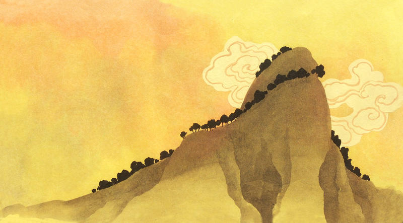
but I realized, I needed to paint big. in the original
painting style in gouache. I needed to show, what I
thought the backgrounds should look like in a technique
everybody could follow.
the little thumbnails I had done looked always a bit out
of focus. blown up to a bigger size that effect was
pretty hard to copy. so ric explained a very old
technique to me - working with a badger brush. the dry
brush softens the edges of the fresh applied color to
the cardboard. I was fascinated by that technique. the
same night at home I tested it and finished my first 3
backgrounds in a 12 field size. they became the first
designs to define the final style of the movie.


No comments:
Post a Comment